

Introduction
Hello there, welcome back to my blog. The much-awaited project with TailwindCSS is here!! Horray! isn't that great?. In the last 3 articles of TailwindCSS series, we discussed the fundamentals of Tailwind, it pro and cons, we discussed customization in TailwindCSS and we even went as far as making our own customized utility and custom classes in TailwindCSS. In this article you are going to learn:
- Mobile-first design.
- Mobile responsiveness with TailwindCSS.
- The usage of different combination of utility classes
If this is your first time hearing about TailwindCSS, be sure to consume the following article and come back and join us here, we would be waiting for you:
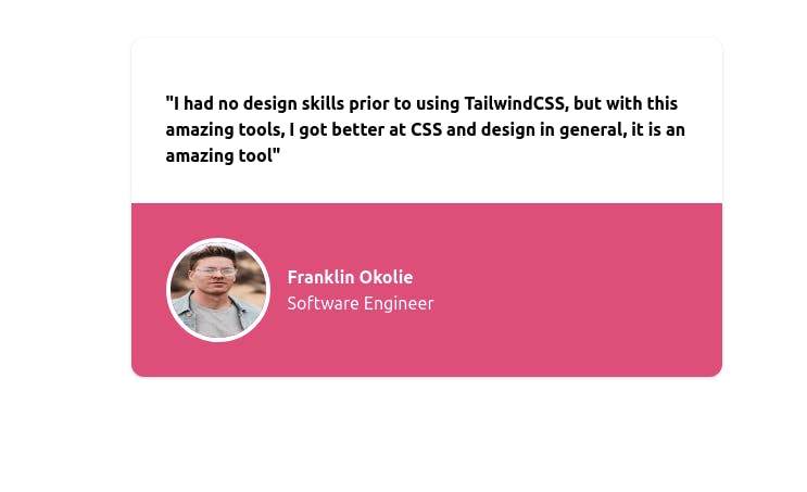
In this article, we are going to be building a testimonial card that bears our name, profession, and the amazing testimony you have about TailwindCSS. Here is mine below:

Is that lovely? I built it without writing any single CSS! just me and TailwindCSS, you are going to learn how to build yours, for the purpose of this article, I will rebuilding mine again with my preferred color, but on your end, I want you to twitch yours by adding your own color, a beautiful picture of you, your name and your profession, just as I did mine.
We are going to make use of Tailwind Playground, and of course, you may choose to use an online environment you prefer, you may even use your code editor on your local machine and go through the learning process of installing Tailwind for this practice, as this would enforce what you have learned previously, you can use the installation guide on this article. If you are going to use any other online code editor, you can check out Codepen. If you are using codepen, let me teach you how to add some settings that would allow you to use TailwindCSS.
- Open a pen, click on the
SettingsTab. - Click on CSS, and scroll down to the
Add External Stylesheets/Pens. Then search for "TailwindCSS". Then click on it and Tailwind is now active in Codepen. Dust your palms.
The Tailwind Playground already has Tailwind embedded, so you don't need any settings for it.
Let build!!!
Now we are set to build, we must know that TailwindCSS is a framework that gives us the opportunity to use a mobile-first
approach to designing anything we want, as that is the method we would use in this project.
First, let create a container section that would contain the whole items in the card.
<section class= "pt-4 bg-white rounded-xl shadow mx-auto my-10 w-4/5">

</section>
So what did we do above?. We gave the container a padding-top of 4, then a background of white, a border-radius using TailwindCSS class rounded-xl which is equal to 0.75rem, added shadow to the card, an mx-auto which means margin on the x-axis(left and right) making it centered on the page, included is also a margin-top of 10 to push it down the page. Then we added a width of w-4/5 which is a Tailwind class for a width equal to 80%. Done? Good.
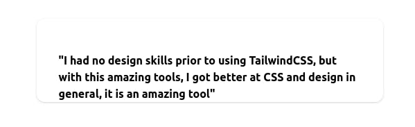
Now, inside the section we are going to create a blockquote to hold our testimonial statement.
<section class= "pt-4 bg-white rounded-xl shadow mx-auto my-10 w-4/5">
<blockquote class="m-8">
    <p class= "font-semibold"> "I had no design skills prior to using TailwindCSS, but with this amazing tools, I got better at CSS and design in general, it is an amazing tool" </p>
  </blockquote>

</section>
We added a margin of 8 on all sides of our blockquote, and we made our testimonial statement semi-bold with the class font-semi-bold. At this time your card should look like this :
 We are doing great!!!. Now let move to the part that contains our name, photo, and profession. We are going to create a
 div to wrap the image and our name + profession.
<section class= "pt-4 bg-white rounded-xl shadow mx-auto my-10 w-4/5">

<blockquote class="m-8">
    <p class= "font-semibold"> "I had no design skills prior to using TailwindCSS, but with this amazing tools, I got better at CSS and design in general, it is an amazing tool" </p>
  </blockquote>


 <div class= "text-white bg-pink-600 p-8 rounded-b-xl">

    </div>

</section>
The div has a background color of pink with a density of 600, with the text of color white, padding of 8 on all sides, a rounded bottom (border-radius of 0.75rem), you can use any background color of your choice.
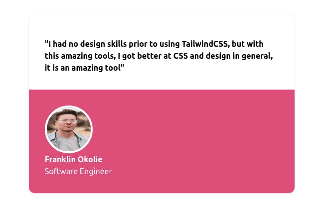
Now let add a photo and text which is our name and profession. I am going to be using a picture from Unsplash.
<section class= "pt-4 bg-white rounded-xl shadow mx-auto my-10 w-4/5">

<blockquote class="m-8">
    <p class= "font-semibold"> "I had no design skills prior to using TailwindCSS, but with this amazing tools, I got better at CSS and design in general, it is an amazing tool" </p>
  </blockquote>


 <div class= "text-white bg-pink-600 p-8 rounded-b-xl">

     <img src="https://images.unsplash.com/photo-1591258739299-5b65d5cbb235?ixid=MXwxMjA3fDB8MHxwaG90by1wYWdlfHx8fGVufDB8fHw%3D&ixlib=rb-1.2.1&auto=format&fit=crop&w=634&q=80" alt="" class="w-24 h-24 rounded-full border-4 border-white " >

     <div>
       <p class= "font-bold"> Franklin Okolie</p>
       <p> Software Engineer</p>
     </div>
    </div>

</section>
Our image has a class of w-24 which means a width of 6rem and h-24 for a height of 6rem also. We made it a rounded-full to make it a circle, and a white border around it, I also wrapped my name + profession in a div to make the code neat and readable. Now your card should look like this :
 Horray! We can dust our palms and move on, but we need to add some more styles to make it presentable on desktop, the styles above will by default apply for desktop screens even as we used a mobile-first approach. On the
 section we are going to add the following:
<section class= "pt-4 bg-white rounded-xl shadow mx-auto my-10 w-4/5 md:w-3/5">
</section>
We just added md:w-3/5 which means for medium screens and above, the width of the section should be w-3/5 which is equal to 60% width. On our div holding the image and the text, we want on the medium screen and above the image and our name + profession to stay side by side. So we can add a flexbox style and center it :
<div class= "text-white bg-pink-600 p-8 rounded-b-xl md:flex md:items-center">
</div>
For our Image, let give it a margin-right on the medium screen to push away from the name+ profession:
<img src="https://images.unsplash.com/photo-1591258739299-5b65d5cbb235?ixid=MXwxMjA3fDB8MHxwaG90by1wYWdlfHx8fGVufDB8fHw%3D&ixlib=rb-1.2.1&auto=format&fit=crop&w=634&q=80" alt="" class="w-24 h-24 rounded-full border-4 border-white md:mr-4">
And we are done!!!. Our card is set and super responsive on all screens from mobile to desktop. Isn't that sweet? we did all of that without writing any single CSS! This should be the number 8 wonder of the world.
Conclusion
I hope you enjoyed this article, I really can't wait to see your testimonial card, can you show me in the comment section?. I have some more to show you.
Tell me if they are beautiful. More articles on TailwindCSS and other topics are coming, so follow to get notified when I publish it. If you find this article useful, share, like, and comment.
If you have any questions concerning Go, Javascript, TailwindCSS, Open-source, or this article? You can reach me on Twitter here. Till next time, see ya. Thank you.