Introduction.
Hello there, welcome back to my blog; in the last article here, we talked about customization in TailwindCSS. One of the pros of TailwindCSS is that everything is customizable, and there are no rules on how classes in TailwindCSS are used and in this article, we would discuss how we can customize classes in TailwindCSS. Unlike Bootstrap, which is a component-class framework, TailwindCSS is a utility-first framework. In Bootstrap, for example, a card components class have been styled by default, all you need to do is add the class, and it generates a card design for you, but this comes with a problem of making all bootstrap website look the same since they all use the same component class. In this article, we will look at how we can create our own customized utility classes and component class in TailwindCSS.
Component class vs. Utility class.
In this section, we are going to be discussing the difference between component classes and utility classes. As we all know, TailwindCSS is a utility-first framework, and you might be forced to ask me, what is utility? Well, that is what we are going to learn in this section. Utility classes mean "one class, one style." In TailwindCSS we are given as many utility classes as possible so we can combine them and make the desired design we need in our Front-end design. Example.
<div class="p-4 text-orange-200 bg-indigo-200">  Hello there
            </div>
Output:
 The above example is an example of the utility classes we are talking about; one class makes one style in our Frontend design.
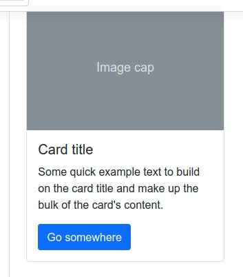
A good example of a component class is that of Bootstrap, which I will use in this example.
<div class="card" style="width: 18rem;">
  <img src="..." class="card-img-top" alt="...">
  <div class="card-body">
    <h5 class="card-title">Card title</h5>
    <p class="card-text">Some quick example text to build on the card title and make up the bulk of the card's content.</p>
    <a href="#" class="btn btn-primary">Go somewhere</a>
  </div>
</div>
Output:

As we see above, the classes there are components class, which mean one class for multiple styles, checking the CSS class for card there must be nothing less than 7 CSS styles to be able to form such a style.
Creating a component class in TailwindCSS.
There may be many situations where, you will need to create your own component class in TailwindCSS for many reasons best known to you, remember component classes is one class, many styles. Here is some reason why we may need to create our own customized component in TailwindCSS:
- Too many classes for one HTML element.
- To avoid repeating one class in different HTML elements.
- To maintain clean code.
- Grouping our classes and styles for neat code.
Example, below are 2 buttons made with TailwindCSS:
<button class="px-4 py-4 text-indigo rounded m-10 bg-pink-300"> Press me </button>
<button class="px-4 py-4 text-indigo rounded m-10 bg-indigo-300"> Press me </button>
Output:

As we can see from the example, they have the same utility classes on them except the background-color, so wouldn't it be nice that we can create a component class to handle this button so we avoid repeating ourselves?. In some enterprise websites, the buttons on the website tend to look alike except maybe the colors as we can see in these cases above. So let make a component class. Kicking off from the last session, assuming we still have our folder we have been using for this series, if not check this article here in the installation guide to see how you can set up your folder structure.
 Now let open our
 src/style.css file and write the following:
@tailwind base;
@tailwind components;
@tailwind utilities;

@layer components {
          .btn{
       @apply px-4 py-4 text-indigo rounded m-10
}
}
Now let explain that, we told TailwindCSS that we want the style to be included in the component's styles, that why we used the @layer components then we created a custom class name .btn that would contain this component, and then we used the @apply to apply the style to be in the components. So now we just have to use .btn as our class and specify the background color and those styles would be made available to us. So let run :
npm run build:css
To build this components in our style sheets. And we can use it:
<button class="btn bg-pink-300"> Press me </button>
<button class="btn bg-indigo-300"> Press me </button>
Output :

Now did you enjoy that? You see that with TailwindCSS we can create as many component class, thereby making a mini Bootstrap, and one of the reasons I love this is that these components are available to only that stylesheet you made it from, meaning in your next project, you may decide not to use component class, remember there are no rules. Hooray!
Creating your own utility class in TailwindCSS.
Although Tailwind provides a pretty comprehensive set of utility classes out of the box, you may run into situations where you need to add a few of your own.
Deciding on the best way to extend a framework can be paralyzing, so here are some best practices to help you add your own utilities in the most idiomatic way possible.
Open the src/style.css
@tailwind base;
@tailwind components;
@tailwind utilities;

@layer utilities {
  .scroll-snap-none {
    scroll-snap-type: none;
  }
  .scroll-snap-x {
    scroll-snap-type: x;
  }
  .scroll-snap-y {
    scroll-snap-type: y;
  }
}
Just like the example of the component, we told TailwindCSS that we need these classes and styles to be added to the utility styles so we can use these classes at the utility level using the @layer.
And that's it, now we can build it by running:
npm run build:css
Now we are done, with this knowledge we have grasped, we can go on to create as many customized Component and Utility classes of your choice.
Conclusion
We have come to the end of the article on creating our own components and utility classes, remember with TailwindCSS there are no limitations with what you can do with it. In the next article we would be making a project with TailwindCSS, so follow me to get notified when I post it.
If you have any questions concerning Go, Javascript, TailwindCSS, Open-source, or this article? You can reach me on Twitter here. Till next time, see ya. Thank you.
