Responsive design with TailwindCSS

A Frontend & Mobile Engineer with over 4 years of experience in the industry, I am passionate about creating engaging, user-friendly, and high-performing websites, mobile and web applications.
Hello there, welcome to my blog. As a developer writing frontend codes to bring designs to life and in turn making amazing websites and applications that user enjoys, I have always hit a roadblock every time that makes me grumble all the time. Can you take a guess? Responsive design!!. As front-end developers, we are burdened with the responsibility of making a website as responsive as it can be so it is not only limited to a few users.
The truth be told I always grumble when writing media queries, a CSS function for making a responsive site, I don't know about you but for me, there is always a screen that my website would look bad in, which makes me spend hours upon hours trying to fix it. All this happened until I met TailwindCSS, the love of my life. Many TailwindCSS developers have testified the ease of writing a frontend application that is responsive to every screen without ever leaving your HTML file or even writing any Media queries, I am one of them.
In this article, you are going to learn how to use TailwindCSS utility classes to make a responsive frontend application without writing media queries. Are you ready? Grab popcorn.
If this is your first time hearing about TailwindCSS, do well to read this article first.
What is responsive design?
Responsive Web design is the approach that suggests that the design and development of an application should respond to the user’s behavior and environment based on screen size, platform, and orientation.
Almost every company these days wants a mobile version of their website. It’s practically important after all: one design for the BlackBerry, another for the iPhone, the iPad, netbook, Kindle — and all screen resolutions must be compatible, too. In the next five years, we’ll likely need to design for a number of additional inventions. When will the madness stop? It won’t, of course. Software engineers just have to adapt to this but that doesn't mean we are not going to create tools that can help us adapt to the speed of the world, and one of those tools is TailwindCSS.
Responsive design with TailwindCSS.
According to the Tailwind documentation.....
Every utility class in Tailwind can be applied conditionally at different breakpoints, which makes it a piece of cake to build complex responsive interfaces without ever leaving your HTML.
There are five breakpoints by default, inspired by common device resolutions:
sm-- 640px minimum-width.md-- 768px minimum-width.lg-- 1024px minimum-width.xl-- 1280px minimum-width.2xl-- 1536px minimum-width.
To add a utility class for styling your app but only have it take effect at a certain breakpoint, all you need to do is prefix the utility with the breakpoint name, followed by the : character:
<img src="example.png" class= "w-24 md:w-34 lg:w-full" alt="" >
What the above means is: when the screen hits 768px(md) the image should resize to w-34 and when it hits 1024px(lg) the image should be 100% in width which is w-full. That the magic of TailwindCSS, this has saved us from writing:
@media (min-width: 768px) { .....}
@media (min-width: 1024px) { ... }
Can you see how sweet TailwindCSS is?. Further below this article, we would see a real-life example of this responsive utility class in action.
Mobile First
90% of users that visit a website or web application uses their mobile phones. I can sit at home and use my phone to order food from uber eats, I don't really need to use a Laptop, while 5% comes from users with tablet devices. This begs the question, "Which screen do I design for first?".
In frontend development, it is now becoming a culture and best practice to do mobile-first development then larger screens such as desktop and laptop comes last. Starting mobile-first design with vanilla CSS is actually tough. But here with TailwindCSS, it is a piece of cake. Trust me.
By default, Tailwind uses a mobile-first breakpoint system, similar to what you might be used to in other frameworks like Bootstrap.
What this means is those unprefixed utilities (like w-24) take effect on all screen sizes, while prefixed utilities (likemd: w-34) only take effect at the specified breakpoint and above.
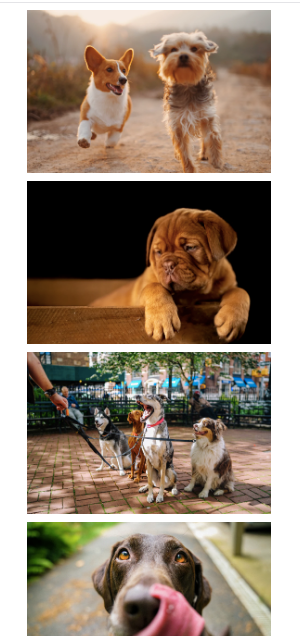
Writing TailwindCSS without specifying the screen breakpoints would apply from the smallest screens to the largest screens. So we can start adding responsiveness by specifying which screen breakpoint should a class have. Below we are going to build a photo gallery containing 4 dogs photos which I would grab from Unsplash, and I would make use of the Tailwind playground to write the code. So let dive in, remember we are doing mobile-first
<section>
<div>
<img class="w-4/5 my-2 mx-auto " src="Dog1.png" alt="">

<img  class="w-4/5 my-2 mx-auto  src="Dog2.png" alt="">

<img  class="w-4/5  my-2 mx-auto  " src="Dog3.png" alt="">

<img  class="w-4/5  my-2 mx-auto " src="Dog4.png" alt="">


</div>


</section>
Note: Links to images were removed to make the markup readable. Here is the link to the project
Here I created a section that would serve as a body tag for us, then created a div that would serve as a container to hold our dog pictures. The images have a width of 4/5 which is equal to 80%, margin-top and bottom of 2( my-2), and a margin-auto for left and right(mx-auto) to center the pictures on the screen. That all for that. This styles would apply to all screens as long as we don't specify a breakpoint, in this case, I want the dogs' pictures to stack on top of each other on mobile but form a grid on larger screens.
Output on mobile:
Just as we want it. But to make it grid-like on larger screens like tablets, desktops, or laptops we have to add a breakpoint, and thanks to the TailwindCSS utility class, we don't need to write any media queries. Here we go:
<section>

<div class="md:grid grid-cols-2 gap-2">
<img class="w-4/5 my-2 mx-auto md:w-full" src="Dog1.png" alt="">

<img  class="w-4/5 my-2 mx-auto md:w-full"  src="Dog2.png" alt="">

<img  class="w-4/5  my-2 mx-auto  md:w-full" src="Dog3.png" alt="">

<img  class="w-4/5  my-2 mx-auto md:w-full" src="Dog4.png" alt="">


</div>

</section>
Here we just added some styles that would apply to a specific breakpoint md which is 768px and above. It is just like saying "when the screen hits 768px and above, apply this style". Simple!
From the above, I made the images 100% width when the screen becomes 768px md:w-full, and for the container div wrapping all the pictures, I made it a grid container, using CSS grid which is available in TailwindCSS, when the screen becomes larger, I want a 2-grid formation, making the pictures 2 on a row and giving it a grid-gap of 2. Easy peasy, No media queries. Such a relief.
Output on a laptop:

Can you believe what we just did? No CSS!!. TailwindCSS is really amazing.
Another project I made with TailwindCSS is Developers fact card and an open-source project. Used TailwindCSS 100% from responsiveness to the grid system. Check it out, and make a PR too!.
With this knowledge in your hands, you can now effectively design your frontend application using TaiwindCSS responsive utilities with the 5 breakpoints without ever worrying about media queries.
In the end...
So we have come to the end of this amazing article. Hope you learned something useful. If you did, like, share, comment, just do anything to make it go viral.
I would be posting more articles, so be sure to follow me to get notified when I post them.
If you have any questions concerning Go, Javascript, TailwindCSS, Open-source, or this article? You can reach me on Twitter. Till next time, see ya. Thank you.


